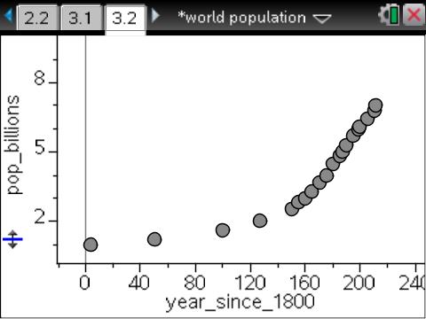
Which is most appealing to you? Which draws you in and generates questions?
Data represented above gleaned from worldometers: real time world statistics.
Infographic from Bits of Science.
Infographic from Data Visualization Encyclopedia, Information Technology, Symbols, Posters, Infographics
Video from NPR. (Watch the video, seriously; it’s only 2:34 and well worth it!)
So…Which is most appealing to you? Which draws you in and generates questions? I think we need all of the above, the hands-on investigation of the data with technology, the infographic that gives perspective, and the video that offers an alternate way to visualize and think about this population growth.
[Note: I’ve written more about PBL ideas for population at Population at 7 Billion – What PBL can we facilitate?.]
I keep thinking about visualization and having multiple representations of ideas. In Five Things Students Want Their Teachers to Know about Online Learning from Tech&Learning, Lisa Nielsen indicates that visualization is important to students. The “five things” student want us to know:
- Socialization is important!
- Students Want to See Each Other
- Students Want to See Their Teacher
- Students Want You to Know Them
- Keep it Relevant
If you read the article, Nielsen indicates that visualization is important when learning online. Video is a tool listed in all five of the above topics.
How are we “leveling up” concerning visualization? Have our learners been introduced to infographics? Better yet, have our learners produced infographics to communicate data creatively? How are we using video to engage our learners? Have our learners produced video to communicate data, learning, and growth? Are we teaching (and learning) 21st century skills if we are not expecting multiple representations of ideas from our learners?
So…In 2012, with lots of technology at our fingertips, if a picture is worth 1000 words, what is video worth?…and…what if we only communicate with text? What learning is lost when/if we only offer one representation of what we want others to learn?
What is lost when we don’t show and tell?
1 image ~ 1000 words…think about it.


[…] I was researching video for my previous post, If a picture is worth 1000 words, what is video worth?, I ran across Nature by […]
LikeLike
Thanks for such a powerful post about the nature of visual representations and the complementary pursuits of text, graphs, infographics, and video. To communicate on multiple dimensions leads to stronger communication…and shared understanding.
LikeLike
[…] If a picture is worth 1000 words, what is video worth? was originally published on January 3, 2012. […]
LikeLike